
To optimize mobile SEO, you need to make your website easy to use on a phone and fast to load. That means using a mobile-friendly (responsive) design, speeding things up by compressing images and cleaning up extra code, and writing short, easy-to-skim content with clear headings. You should also add local keywords (like your city or neighborhood) and use structured data so Google better understands your pages. Do these things, and your site is much more likely to show up higher when people search on their phones.
Key Takeaways
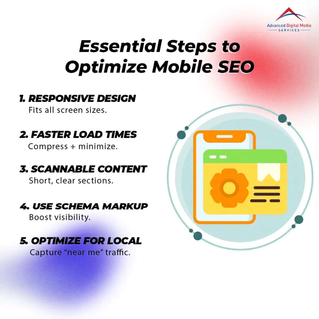
- Utilize responsive design to ensure your site adapts seamlessly to various screen sizes for optimal user experience.
- Improve mobile site speed by compressing images and minimizing code to enhance loading times and reduce bounce rates.
- Write concise, scannable content with clear headings and bullet points to enhance readability on mobile devices.
- Incorporate structured data and local keywords to improve search visibility and attract nearby customers effectively.
- Conduct regular mobile SEO audits to identify and fix issues related to usability and performance, ensuring long-term growth.
Why Mobile SEO Is Crucial for Online Success
Mobile SEO is essential because Google now prioritizes mobile-first indexing, meaning your site’s mobile version is vital for search rankings. If your website isn’t optimized for mobile, you could lose potential customers due to a poor user experience. A seamless mobile experience can greatly boost your conversions and overall online success.
The Rise of Mobile-First Indexing by Google
As Google increasingly prioritizes mobile-first indexing, businesses can’t afford to ignore the importance of mobile SEO. Mobile-first indexing means that Google uses your site’s mobile version as the primary source for ranking and indexing. To stay competitive, consider these key factors:
- Responsive Design: Ensure your website adapts seamlessly to different screen sizes.
- Fast Loading Times: Optimize images and reduce unnecessary scripts to improve speed.
- User-Friendly Navigation: Simplify menus and make it easy for users to find what they need.
- Localized Content: Tailor your content for mobile users in specific geographic areas.
How Mobile Optimization Affects User Experience and Conversions
While many factors contribute to online success, optimizing for mobile SEO is essential because it directly impacts user experience and conversion rates. When your website is mobile-friendly, users can easily access information without frustration. Mobile-friendly navigation and menus allow visitors to find what they need quickly, reducing bounce rates and increasing engagement. A smooth, intuitive experience encourages users to stay longer and explore your offerings. Additionally, search engines favor mobile-optimized sites, which can improve your rankings and visibility. As a result, investing in mobile SEO not only enhances user experience but also boosts your chances of converting casual visitors into loyal customers. Prioritizing mobile optimization is key to thriving in today’s digital landscape.
Step 1: Ensure Your Website Is Mobile-Friendly
To kick off your mobile SEO optimization, you need to guarantee your website is mobile-friendly. Start by using responsive design so that your site looks great on any screen size, and simplify navigation for easier use on smaller devices. Finally, test your site’s mobile usability with Google’s tools to spot any issues that could affect user experience.
Using responsive design to adapt across all screen sizes
Ensuring your website is mobile-friendly is essential in today’s digital landscape, where over half of all web traffic comes from mobile devices. One effective way to achieve this is by using responsive web design for SEO. It allows your site to adapt seamlessly across all screen sizes. Here are four key benefits:
- Improved User Experience: Users can easily navigate your site, regardless of their device.
- Better SEO Rankings: Search engines favor mobile-friendly sites, boosting your visibility.
- Cost-Effective Maintenance: One design for all devices means less hassle and lower costs.
- Increased Conversion Rates: A responsive design encourages visitors to stay and engage with your content.
Simplifying navigation for smaller devices
As mobile usage continues to dominate internet traffic, simplifying navigation for smaller devices has become essential for enhancing user experience. In The Importance of SEO in the Digital Age, it becomes clear that to effectively implement mobile SEO best practices, you should prioritize intuitive and straightforward navigation. Start by reducing the number of menu items to only the most important ones, making it easier for users to find what they need quickly. Consider using a hamburger menu to save space, ensuring it’s easily accessible. Also, utilize clear, concise labels that resonate with your audience. Don’t forget about touch-friendly buttons; they should be large enough to tap without frustration. By streamlining navigation, you not only improve user satisfaction but also boost your site’s performance in search engine rankings.
Testing your site’s mobile usability with Google’s tools
A solid mobile-friendly website is essential for capturing your audience’s attention and keeping them engaged. To verify your site meets mobile usability standards, you should start testing mobile friendliness with Google tools. Here are four key steps to help you out:
- Use Google’s Mobile-Friendly Test: Input your URL to check if it’s mobile-friendly.
- Analyze Mobile Usability Reports: Review these reports in Google Search Console for insights on issues.
- Check Page Speed: Utilize Google PageSpeed Insights to evaluate loading times and mobile performance.
- Conduct Real User Testing: Gather feedback from actual users to identify any practical issues.
Step 2: Improve Mobile Site Speed and Performance
Now that your website is mobile-friendly, it’s time to focus on speed and performance. Compressing images, minimizing code, and leveraging caching can make a significant difference in how quickly your site loads. Faster load times not only improve user experience but also boost your rankings and reduce bounce rates.
Compressing images and minimizing code
To enhance your mobile site’s speed and performance, compressing images and minimizing code are essential steps. Optimizing images for mobile devices not only improves loading times but also enhances user experience. Here are some tips to help you get started:
- Use image formats like JPEG or WebP for better compression.
- Resize images to the appropriate dimensions before uploading.
- Minimize CSS and JavaScript files by removing unnecessary characters.
- Combine multiple files into one to reduce HTTP requests.
Leveraging caching and content delivery networks (CDNs)
Improving your mobile site’s speed and performance goes beyond just compressing images and minimizing code; leveraging caching and content delivery networks (CDNs) can greatly enhance user experience. Caching stores frequently accessed data, allowing users to load pages faster without repeatedly fetching the same information. This is essential for mobile users who expect quick access.
CDNs distribute your content across various servers worldwide, reducing the physical distance between the user and the server, which speeds up loading times. By implementing these mobile page speed optimization tips, you guarantee that your content is delivered efficiently, leading to happier visitors. Plus, a faster site can keep users engaged longer, ultimately benefiting your overall mobile SEO efforts.
Why faster load times lead to better rankings and lower bounce rates
Since mobile users often expect instant access to information, faster load times play an important role in both user experience and SEO performance. When your site loads quickly, you not only keep users engaged but also improve your rankings. Here’s how faster load times can benefit you:
- Lower Bounce Rates: Users are less likely to leave your site if it loads quickly.
- Improved Core Web Vitals: Google prioritizes sites that meet these metrics, enhancing your mobile performance.
- Better User Experience: A smooth experience encourages repeat visits and builds trust.
- Higher Conversion Rates: Fast-loading pages lead to more actions taken, boosting your bottom line.
Optimizing for speed isn’t just a technical fix—it’s an essential strategy for online success.
Step 3: Optimize Content for Mobile Users
To truly connect with your mobile audience, you need to optimize your content effectively. Focus on writing concise, scannable text with clear headings, and don’t forget to use structured data for better search visibility. Incorporating local SEO strategies can also help boost your chances of appearing in “near me” searches, making it easier for users to find you.
Writing concise, scannable content with clear headings
When users access your content on mobile devices, they expect quick, digestible information that’s easy to navigate. To meet these expectations, focus on writing concise, scannable content with clear headings. Here are some tips to enhance readability:
- Use Short Paragraphs: Keep paragraphs brief to avoid overwhelming readers.
- Incorporate Bullet Points: Break down complex information into bite-sized pieces.
- Utilize Subheadings: Clearly label sections to help users find what they need quickly.
- Highlight Key Information: Use bold or italicized text to draw attention to important points.
Using structured data and schema markup for search visibility
Incorporating structured data and schema markup can markedly enhance your mobile SEO efforts, as it helps search engines better understand your content. By using structured data, you’re providing context that makes it easier for search engines to categorize and display your information. This can greatly improve your search visibility on mobile devices. For instance, using schema markup for search visibility allows you to highlight important details like reviews, ratings, and event information, making your listings more attractive in search results. This can lead to higher click-through rates, especially on mobile, where users are looking for quick, relevant answers. Don’t overlook the power of structured data; it’s a game-changer for optimizing your mobile content.
Incorporating Local SEO for Mobile Searches and “Near Me” Results
Optimizing your content for mobile users means not just focusing on technical aspects but also enhancing your local SEO strategy. With the rise of “near me” searches, local mobile search optimization is essential. Here are four tips to improve your local presence:
- Claim your Google My Business listing – Confirm your business info is accurate and up-to-date.
- Use local keywords – Incorporate location-specific terms in your content and meta tags.
- Encourage customer reviews – Positive feedback helps boost your credibility and visibility in local searches.
- Create location-based content – Tailor your blog posts or web pages to address local events or interests.
Boost Your Rankings with ADMS Advanced Digital Media Services
If you want to boost your mobile rankings, ADMS Advanced Digital Media Services can help. Their expert mobile SEO audits and responsive web design guarantee your site meets the latest standards for success. Contact them today to enhance your mobile performance and attract more customers.
Expert Mobile SEO Audits and Optimization Strategies
When it comes to boosting your website’s visibility on mobile devices, expert mobile SEO audits and optimization strategies are crucial. You need to understand how to make a website mobile-friendly to enhance user experience and search rankings. Here are some key strategies to take into account:
- Responsive Design: Confirm your site adapts to various screen sizes for ideal viewing.
- Page Speed: Optimize loading times, as slower pages can lead to higher bounce rates.
- Content Formatting: Use shorter paragraphs and larger fonts to improve readability on mobile.
- Local SEO: Implement local keywords and listings to attract nearby customers effectively.
Responsive Web Design and Technical SEO for Long-Term Growth
To guarantee your website thrives in the competitive digital landscape, incorporating responsive web design and robust technical SEO is vital for long-term growth. A responsive design ensures your site looks great on any device, enhancing user experience and boosting engagement. This is essential for mobile SEO, as search engines favor sites that provide seamless experiences across platforms.
Additionally, implementing technical SEO strategies, like optimizing AMP pages, can greatly enhance your site’s performance on mobile devices. By focusing on fast-loading pages and proper indexing, you’ll improve your chances of ranking higher in search results. Together, responsive web design and technical SEO for long-term growth create a solid foundation that keeps your business competitive and visible in the ever-evolving digital space.
Contact ADMS today to enhance your mobile performance and attract more customers.
Ready to take your mobile performance to the next level? Contact ADMS today and let’s work together to enhance your mobile user experience and attract more customers. Our expert team specializes in tailored strategies that drive results. Here’s how we can help:
- Optimize your site for mobile devices to improve load times.
- Create engaging content that resonates with your audience.
- Implement responsive design to guarantee users have a seamless experience.
- Analyze performance metrics to continually refine your strategy.
Don’t miss out on potential customers due to poor mobile performance. With ADMS, you’ll boost your search rankings and convert more leads. Reach out today and see the difference we can make for your business!
Frequently Asked Questions
What Are Common Mobile SEO Mistakes to Avoid?
You should avoid common mobile SEO mistakes like neglecting responsive design, failing to optimize loading speeds, ignoring local SEO, using intrusive pop-ups, and not ensuring your content is easily readable on smaller screens.
How Does Voice Search Impact Mobile SEO?
Voice search considerably impacts mobile SEO by prioritizing natural language and conversational phrases. You’ll need to optimize content for questions and local searches, ensuring your site is easily accessible and relevant to voice query results.
What Role Does Local SEO Play in Mobile Optimization?
Local SEO is essential in mobile optimization since most users search for nearby businesses. By optimizing your listings, you’ll increase visibility in local searches, driving foot traffic and enhancing your overall mobile user engagement.
How Can I Measure Mobile SEO Success?
To measure mobile SEO success, track key metrics like organic traffic, bounce rates, and conversion rates. Think of a flower blooming; the more visitors you attract, the healthier and more vibrant your online presence becomes.
Are There Specific Tools for Mobile SEO Analysis?
Yes, there are several tools for mobile SEO analysis, like Google Mobile-Friendly Test, PageSpeed Insights, and SEMrush. These tools help you assess performance, usability, and optimization specifically for mobile devices, ensuring a better user experience.
Conclusion
As you sail the digital seas, remember that a well-optimized mobile site is your sturdy ship. With responsive design as your sail and speed as your wind, you’ll navigate the waves of user experience smoothly. Craft your content like a treasure map, guiding users to discover what they seek. By embracing these strategies, you’re not just chasing rankings; you’re charting a course toward lasting success. Keep your compass aligned with the latest trends, and watch your audience grow.