When choosing between responsive design and mobile-first design for SEO, you should consider your audience. Responsive design adapts layouts for different devices but may not always optimize performance for mobile users. In contrast, mobile-first design focuses on mobile experiences from the start, enhancing speed and user satisfaction. Since Google prioritizes mobile indexing, your choice can greatly impact search rankings. If you want to learn more about these approaches, stick around!
Key Takeaways
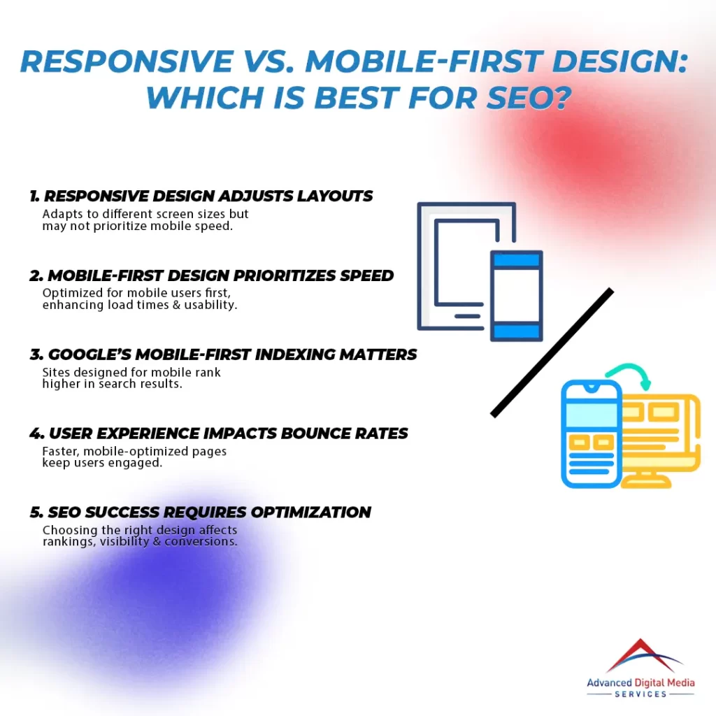
- Responsive design adapts to various screen sizes but may lack optimal performance for mobile users if initially designed for desktops.
- Mobile-first design focuses on mobile users from the start, leading to improved performance and faster load times on mobile devices.
- Google prioritizes mobile versions for indexing, making mobile optimization essential for maintaining search rankings and visibility.
- Page speed and user experience are critical for SEO; mobile-first design principles enhance these factors, reducing bounce rates and increasing engagement.
- Regular testing and media optimization are crucial for both design approaches to ensure effective performance and adherence to mobile SEO best practices.
Understanding Responsive Design and Mobile-First Design
When you’re considering how to design your website, understanding responsive and mobile-first design is essential. Responsive design adjusts your site to fit various screen sizes, while mobile-first design prioritizes mobile devices from the start. Both approaches can greatly impact your site’s performance and SEO, so it’s vital to know how they work.
What is Responsive Design and How Does It Work?
While many websites today aim for ideal user experience, responsive design stands out as an important approach that adjusts a site’s layout based on the device’s screen size. This means that whether someone’s using a smartphone, tablet, or desktop, the site will automatically rearrange its elements to guarantee maximum viewing. Responsive design for mobile is particularly vital, as more users access the web via their phones. By implementing flexible grids, images, and CSS media queries, responsive design delivers a seamless experience, reducing the need for users to zoom or scroll excessively. This not only enhances user satisfaction but also plays a significant role in SEO, as search engines favor sites that provide great experiences across all devices.
What is Mobile-First Design and Why is It Important?
Mobile-first design flips the traditional web design approach by prioritizing the mobile experience before scaling up to larger screens. This method guarantees your website is optimized for mobile users, who increasingly dominate web traffic. By focusing on mobile experiences first, you’re not just making a site that looks good on smaller devices; you’re enhancing usability and performance, which can greatly impact your SEO rankings. In the mobile-first design vs responsive design debate, mobile-first is often seen as a more proactive strategy, catering to evolving user behavior. It helps you address speed, accessibility, and engagement right from the start, leading to better user retention and satisfaction. Ultimately, adopting a mobile-first design aligns your site with current digital trends and user expectations.
Key Differences Between Responsive and Mobile-First Design
When comparing responsive design and mobile-first design, it’s essential to take into account how each approach affects user experience. You’ll also want to reflect on the technical implementation and development challenges that come with each method. Understanding these key differences can help you make better decisions for your website’s design strategy.
How Each Approach Impacts User Experience
Understanding how responsive design and mobile-first design affect user experience is essential for creating websites that engage visitors effectively. With responsive design, your site adjusts to various screen sizes, ensuring a consistent experience across devices. However, it may sometimes prioritize desktop layouts, which can compromise mobile usability. In contrast, mobile-first design starts with mobile users in mind, optimizing performance and features specifically for smaller screens first. This approach often leads to faster load times and better navigation on mobile devices, enhancing user satisfaction. In the debate of mobile first vs. responsive design, prioritizing a mobile-first strategy can greatly improve the overall experience for your audience, ultimately keeping them engaged and encouraging return visits.
Technical Implementation and Development Considerations
While both responsive and mobile-first design aim to optimize websites for various devices, their technical implementation and development considerations differ markedly. With mobile-first responsive web design, you prioritize the mobile experience, developing features for smaller screens first. This approach can lead to cleaner code and faster load times. Here are some key considerations:
- Development Process: Mobile-first often requires a different coding approach.
- Media Queries: Responsive design uses them to adjust layouts, while mobile-first starts with mobile queries.
- Performance: Mobile-first can improve performance on mobile devices.
- Design Flexibility: Responsive design might be easier to adapt for varying screen sizes.
- SEO Benefits: Mobile-first can provide a competitive edge in search rankings.
Understanding these differences can help you make an informed choice for your project.
SEO Implications of Responsive vs. Mobile-First Design
When it comes to SEO, understanding the differences between responsive and mobile-first design is essential. Google’s Mobile-First Indexing means your site’s mobile version is what counts for rankings, so you can’t ignore how these designs affect page speed and load times. Let’s explore how these factors play a role in your site’s performance and visibility.
Google’s Mobile-First Indexing and Its Impact on Rankings
As Google continues to prioritize mobile user experiences, the shift to mobile-first indexing greatly influences how websites are ranked in search results. If you’re considering mobile first design vs. responsive design, understanding this impact is essential. Here’s what you need to know:
- Mobile-first indexing means Google mainly uses the mobile version of your site for ranking.
- If your site isn’t optimized for mobile, you risk lower rankings.
- Responsive design can work, but it needs to perform well across devices.
- Content visibility on mobile is critical; make sure everything’s accessible.
- Page loading speed and user experience on mobile are key ranking factors.
Making the right choice between mobile first design vs. responsive can markedly affect your site’s SEO performance.
Page Speed, Load Times, and Core Web Vitals Considerations
Understanding the nuances of page speed, load times, and Core Web Vitals is crucial for optimizing your website’s SEO, especially when choosing between responsive and mobile-first design. Mobile-first design best practices emphasize creating a fast, efficient user experience from the start, leading to better load times and improved Core Web Vitals scores. By prioritizing mobile performance, you guarantee your site’s elements are optimized for speed, helping to reduce bounce rates and increase engagement. On the other hand, responsive design might not always deliver the same level of performance, especially if it’s retrofitted to an existing site. Ultimately, focusing on mobile-first principles can greatly enhance your SEO efforts and user satisfaction.
Choosing the Right Design Approach for Your Website
When choosing the right design approach for your website, you need to take into account your business goals and audience. It’s essential to align your design strategy with the best practices for optimizing your site for mobile SEO. This way, you can guarantee that your site performs well and reaches the right users effectively.
Factors to Consider Based on Business Goals and Audience
Choosing the right design approach for your website hinges on your business goals and audience needs. If you’re targeting users who primarily browse on mobile devices, a mobile-first responsive design may be the best fit. Consider these factors:
- User Demographics: Know who your audience is and how they access your site.
- Business Objectives: Align your design with what you want to achieve, like sales or brand awareness.
- Content Strategy: Assess the type of content you offer and how it performs on different devices.
- Competition: Analyze competitors to see what design approaches they’re using.
- Future Scalability: Think about how your design will adapt as your business grows.
Making the right choice can greatly impact your SEO success!
Best Practices for Optimizing Your Site for Mobile SEO
Optimizing your site for mobile SEO is essential, especially as more users access websites on their smartphones. First, consider adopting a mobile-first approach, which prioritizes the mobile experience. This can improve loading times and user engagement. When choosing between mobile-first vs responsive design, think about your audience and their needs. Make sure your content is easily readable on smaller screens by using larger fonts and clear calls to action. Additionally, optimize images and videos for mobile to reduce load times. Implement structured data for better visibility in search results and test your site regularly with tools like Google’s Mobile-Friendly Test. Following these best practices will help make certain your site ranks well and provides a seamless experience for mobile users.
Frequently Asked Questions
Can I Use Both Responsive and Mobile-First Design Together?
Yes, you can use both responsive and mobile-first designs together. By implementing elements of each approach, you can enhance user experience across devices, ensuring your site looks great and performs well, regardless of screen size.
What Tools Help Create Responsive or Mobile-First Designs?
To create responsive or mobile-first designs, you can use tools like Adobe XD, Figma, or Sketch for design, while frameworks like Bootstrap or Foundation help guarantee your layout adapts seamlessly across different devices.
How Does Design Choice Impact Website Loading Speed?
Your design choice can considerably impact website loading speed. If you prioritize optimized images and streamlined code, your site loads faster, enhancing user experience and potentially improving your search engine rankings. Every millisecond counts!
Are There Specific Industries That Benefit More From One Design Type?
Certain industries, like e-commerce and travel, thrive on mobile users, benefiting from mobile-first design. Meanwhile, sectors like news and education may find responsive design more effective, catering to diverse device usage and user needs.
Do Responsive and Mobile-First Designs Affect User Experience Differently?
Yes, responsive and mobile-first designs can affect user experience differently. With mobile-first, everything’s optimized for mobile users first, improving loading times and accessibility. Responsive designs adapt to various devices, but may not prioritize mobile users as effectively.
Conclusion
In the grand tapestry of web design, choosing between responsive and mobile-first design is like selecting the perfect thread for your masterpiece. Each approach has its merits, weaving a unique narrative for your site’s SEO journey. While responsive design offers flexibility, mobile-first design champions a streamlined user experience. To reach success, adjust your strategy to match the evolving digital environment and the preferences of your target audience, much like a seasoned navigator adjusts their route to reach their desired port.