I’m sure you’ve heard the sayings “less is more” and “simplicity is key.” These mottos embody the concept of minimalism. Minimalism has been steadily on the rise among different fields, including architecture, interior design, art, music, and many more. It should therefore come as no surprise that it is also one of the hottest 2020 web design trends.
However, simple does not always equate to easy. A minimalist web design can be trickier because you cannot just fill it with content. It has to be well-curated while at the same time an interest-catcher.
Why Opt for Minimalism?
Successful minimalist web designs make your content stand out. It provides a more user-friendly experience to consumers while simultaneously providing an easy-to-maintain website for companies. Minimalistic designs are also more responsive to devices. Given their relative simplicity and fewer features, minimalistic websites are able to adapt to different screen sizes easily and load content a lot faster.
Minimalism: Not Really Less
Minimalist web design templates, while trying to remain as simple as possible, still require different characteristics to stand out. Here are five important characteristics of a minimalist web design.
1. Negative Spaces
With simplicity comes a lot of space: negative space. The goal of minimalistic design is to remove all unnecessary content from the website, leading to lots of empty spaces. Because of this, it becomes easier to direct the user’s focus and attention and highlight the minimal yet important content. The more negative space you have around certain content, the more the user will be drawn to it.
Negative spaces are usually connected with white or black backgrounds because of the notion of luxury associated with these colors. However, you can also use different full-color backgrounds to fill negative space, depending on your brand identity.
2. Limited Color Contrast
Because of their limited visuals, colors play a major role in minimalist designs. A minimalist design limits itself to a maximum of three colors at once. It’s the colors that mostly fill the aesthetic requirements of minimalist websites.
A clever contrast of colors, especially around your content, makes it easier to highlight these features. Use colors that can grab the attention of the viewer and portray the vibe you want your viewer to associate with your company.
3. Dramatic Typography
With most visual elements removed, your words will be the center of your website. Minimalist designs employ the use of different font styles, sizes, and effects. Experimenting with fonts is the easiest way to highlight your brand name and recognition within your website. You can do a contrast between large and small texts depending on which content you want the user to focus on.
Using text also means faster load time and a more compatible and less technical website compared to using lots of complicated visuals. Remember, however, that fonts and sizes are only as good as your content. Be sure to select the best information to share with your viewers.
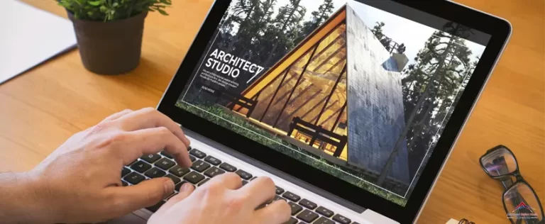
4. Large and Powerful Images
A minimalist design doesn’t mean no images at all. However, the images should be both simple and rich. These photos are meant to instantly evoke emotion and create an atmosphere that resonates with your viewers. You should be picky when choosing which image to include in your design because the choice of a wrong photo can easily ruin your concept. Their color schemes, use of negative space, and the amount of text should be in line with the concept of minimalism.
5. Easy and Effortless Navigation
Simplicity does not just refer to the website’s look; the user’s overall experience is important as well. Be sure to remove unnecessary buttons and make your links and instructions straightforward, especially if your website contains different pages and segments.
For websites with more than two images, you might want to try a grid layout. It makes your content more organized and symmetrical, allowing your viewers to scan quickly. For items on your website, you can use hamburger menus, wherein your items are listed in horizontal rows. An easily accessible and navigable website has a higher chance of repeated visits from a user.
Curating a minimalist website is an intricate business. One wrong choice in color or font style can easily ruin the look you want to portray. Because of this, we strongly suggest that you hire only the best web design company for the job. Advanced Digital Media Services offer only the best web design services for you and your business. Talk to us by filling out the form below.