A responsive website provides an excellent user experience.
With the continued evolution of technology comes devices with different screen sizes and resolutions. As long as they are connected to the internet, they are all you need to browse, get information, and communicate.
Mobile phones and gadgets are everywhere; it’s not surprising that mobile web traffic has overtaken the use of desktops in terms of searches and market shares. According to Statcounter, more than 50% of the total traffic comes from mobile phones.
For this reason, it is no longer enough to have a website designed only for a single device. The more diverse portable devices become, the more you need your website to be as responsive as possible.
Importance of a Responsive Website
More than half of your website visitors use mobile phones. If you designed your website for desktops, don’t expect mobile users to have a positive experience and stay on your page. People quickly judge a business through its website design, content, and user experience. If people do not see what they want in the first few seconds of their visit, they are more likely to leave your website and visit a competitor instead.
A responsive website design expands your reach, makes it accessible for user engagement, and clears the way for lead conversion.
A responsive website automatically adapts to a device’s screen – whatever the size may be. It allows your pages to fit all possible screen sizes and resolutions so that no essential information is compromised and links are easily accessed.
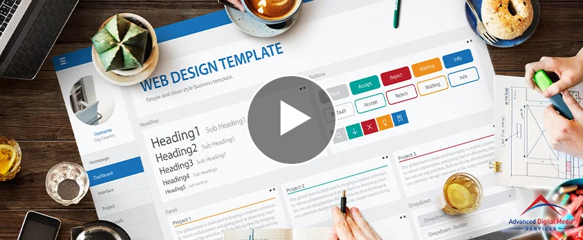
How to Design a Responsive Website
Designing a responsive website is about its layout on different portable devices and giving it flexibility in giving out information and services users need efficiently and accurately.
Cascading Style Sheets (CSS) and HyperText Markup Language (HMTL) are the main foundations of a responsive website design layout, controlling the page’s layout on any browser. HTML dictates the content while CSS modifies the design and display, completing the webpage interface.
The combination of these languages and the following features support a responsive design for websites.
Fluid Grid
The fluid grid distributes the website proportionally for a wide array of screen sizes and resolutions. There is no fixed width or height, allowing all elements to adapt to the screen requirements of the device.
Flexible Images
When you have a responsive layout, images need to be in the right size, whatever the screen size. Resizing them in proportion to the screen prevents distortion.
Media Queries
A feature in CSS customizes how the website appears. It binds the flexibility of layout and images together. Gathering data and applying needed CSS styles renders content that adapts to the specific resolution and screen requirement. It also adds, moves, or hides specific content to allow users to enjoy the webpage displayed on the screen.
Speed
One of the first things to consider in designing a page is how fast it would load and how smooth it would be. A page that loads for five seconds or more has a 40% bounce rate, a deadly rate for users and Google.
Technology will continue to evolve, and screen sizes will continue to vary. But, with the help of a responsive website design, your business can cope with any challenges that this changing world may bring.
Where to Get Responsive Website Design Services
Advanced Digital Media Services is here to give you a responsive website design.
Getting help from professionals is one of the wisest moves you can make as a business investment. We at ADMS are skilled in making any website accessible and responsive on any device. Being an SEO company, we have mastered the art of website design, website development, and website content. Should you need us, we are here to help you achieve your digital needs.


